Moyne Shire Caravan Parks
Branding and Print Design

About The Client
The Moyne Shire is located in the south west region of Victoria. The Shire consists of many townships, but it’s most known for the coastal town of Port Fairy.
The Shire Council owns 6 caravan parks and a lodge that are spread out across the region. These parks include:
- Gardens Caravan Park
- Southcombe Caravan Park
- Southcombe Lodge
- Yambuk Lake Caravan Park
- Koroit Tower Hill Caravan Park
- Killarney Caravan Park; and
- Mortlake Caravan Park
The parks range in size and facilities. However, each park is located in a premium location, either close to the Port Fairy township or to local beaches and other tourist attractions.
The Moyne region is a popular travel destination for a variety of travellers partly due to its strong events calendar and also its idyllic location.
The Client’s Problem
The Moyne Shire recognised that the caravan parks had been operating at the same business level for many years. The Shire identified that the parks needed to modernise to meet the requirements of travellers to the region.
The Shire was wanting visitors to return to the region and explore the other caravan parks they have to offer. Most visitors were not aware of the other park locations as there was not a clear connection between each of them.
Only two out of the six parks possessed their own brand, which were dated and deployed with a great deal of inconsistencies. There was also no hint that the two parks belonged to the same group.
As each of the parks did not possess their own identity, it lead to difficulties in promoting each location in an already competitive market in the Port Fairy region.

The Propeld Solution
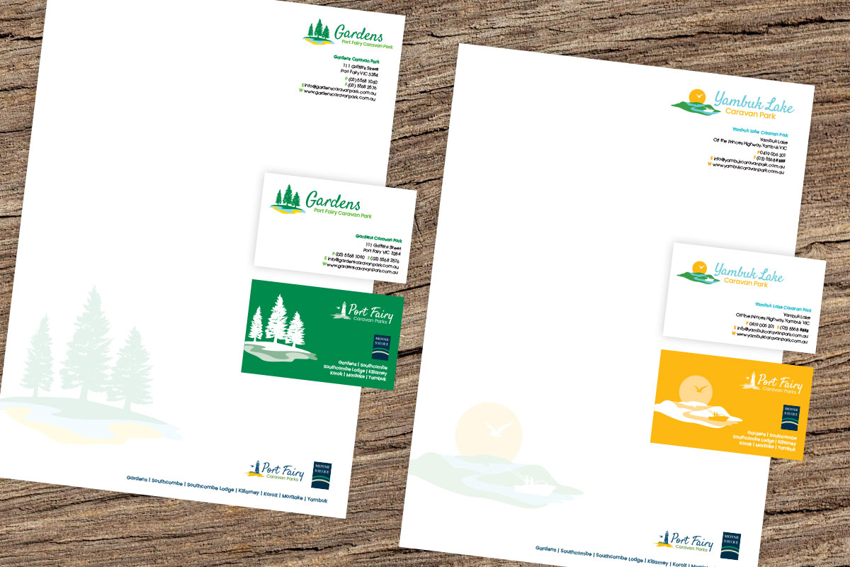
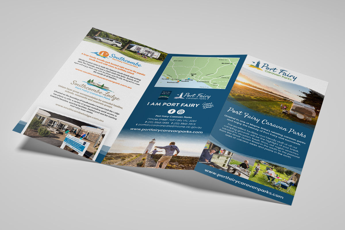
To tie all of the parks together we created the umbrella brand of Port Fairy Caravan Parks. The name was chosen to help compete against their other online competition and rank well in search engine results.
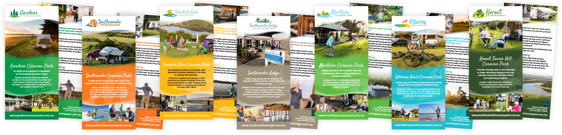
The iconic Port Fairy lighthouse and mutton birds were illustrated in the umbrella brand. We used a distinct modern style, which was carried through to the redesign of each of the other Parks new logos. The end result being a matching suite of eight logos representing the region, the six parks and the lodge. A logo mark illustration was produced for each of the logos which identified the unique characteristics of each of the parks, with complimenting colour palettes.
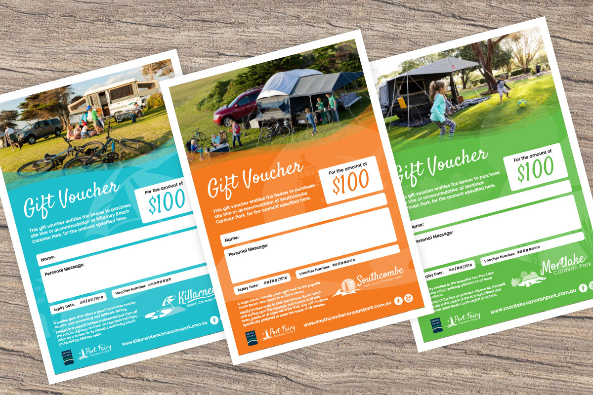
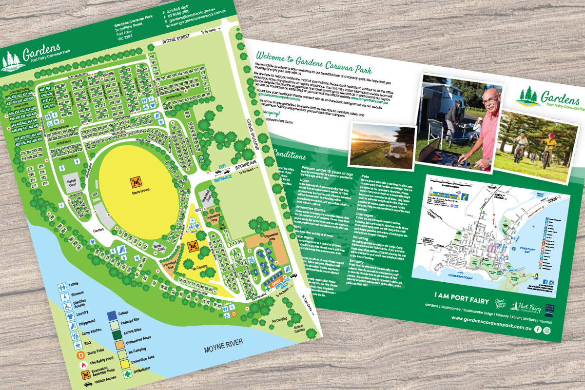
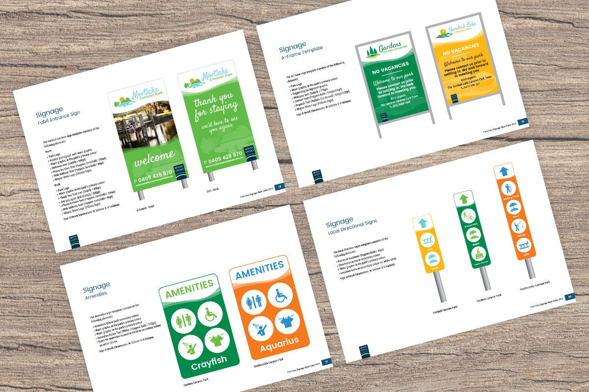
Propeld rolled out each of the brands on the client’s new websites, park stationery, individual brochures, park maps, gift vouchers and a comprehensive style guide for all of the signage around the parks. All of this resulted in a strong and consistent brand between each of of the parks increasing brand recognition and connecting all of the parks together as one single organisation.