Your homepage is one of the most significant pages on your entire website. For many users, it is the starting point for their introduction to who you are, what you offer and why they should trust you to book.
Offering a poor user experience at this early stage of their journey with you will make them want to leave and look elsewhere.
On the other hand, a homepage that offers a decent user experience will be far stickier and will guide customers to learn more and engage with your brand.
The 6 Sections On Your Website’s Homepage You Need To Have
First, let’s discuss sections and why you need to use them.
Trying to communicate information in large slabs of text without breaks can tire your visitor and cause them to feel overwhelmed. One way to combat this is to ‘chunk up’ your content into sections, allowing users to skim and pause on relevant information without reading every word. Breaking up content into sections encourages visitors to keep scrolling and engaging with your site.
Yes, your homepage will be long with six sections, but thanks to mobile phones, users have scrolling (and swiping) so ingrained in their online behaviour now that it is second nature.
This is where the importance of subheadings comes in at the start of each section. David Ogilvy tells us that “on average, five times as many people read the headline as read the body copy”. So making sure you have catchy subheadings throughout your content will aid in capturing the viewer’s attention and cause them to pause and investigate further as they skim.
Each section needs to have a distinct purpose. The six sections we recommend every website needs to have include:
- Brand Positioning
- Introduction to the Brand’s Story
- Main selling points
- Secondary selling points
- Social Proof
- Kitchen sink
Brand Positioning
The first section on your homepage should be your hero section that outlines your brand’s proposition.
Getting this section right is crucial to letting the visitor know that they are exactly where they need to be. This section is your first opportunity to engage and establish trust with your prospect. So, just like you would if you met someone in real life, you need to make a good first impression.
Here are non-negotiables that you have to show in this section:
Your logo needs to be on display. The top left corner of the site is a common place for the logo to sit, and it immediately shows the customer who you are and that they are in the right place – if they searched for you directly.
An easy-to-use menu for navigation around your site. Don’t make the mistake of trying to fit every page on your website into your navigation menu (this is what the kitchen sink is for, but we’ll get to that later). Try to limit your main menu to 4-6 core pages on your website, with one of those links being a Call To Action (Book Now etc.) item.
Hero Photography or Video. This is your first chance to wow your audience, so make sure you showcase your best content. While a great hero photo can work wonders, a video background showing your business’s best parts will make your website instantly engaging.
Your brand positioning statement. This statement is a short sentence that explains what makes you different to your competitors. It might be as short as a tagline, or it could be a little bit longer. The important thing is to not be overly wordy and to craft a statement that captures the visitor’s attention quickly and is memorable.
Clear calls to action. Make sure you tell the visitors exactly what you want them to do next. It might be encouraging them to view your services or a stronger call to action like booking in immediately. If you have a well-known brand, then asking visitors to book in straight can work well. However, if you are a new player, customers might need to learn a bit more about you and your business before clicking that book now button.
Examples of the brand position section
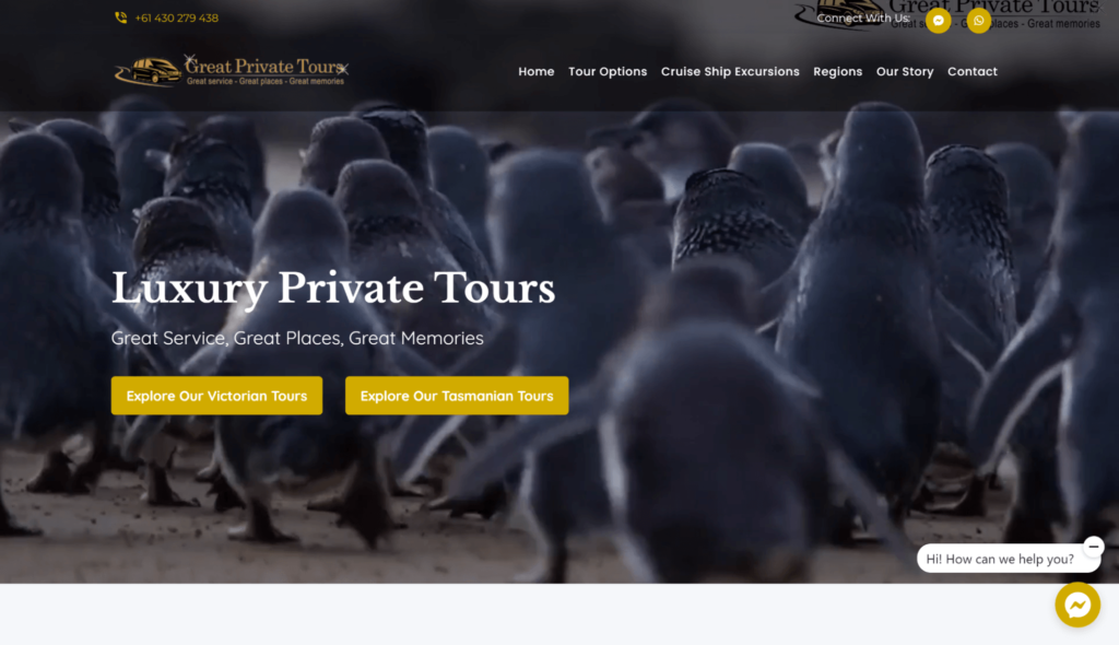
Great Privates Tours:
https://www.greatprivatetours.com.au
- Logo easily visible in the top left corner
- The menu is simple and easy to use
- The video background of the service on offer is instantly engaging
- Brand positioning is clear, with both statements explaining what Great Private Tours stands for.
- The two calls to action let visitors take the next step on their booking journey.
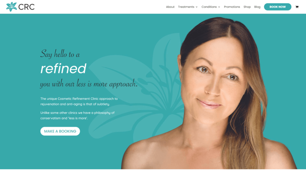
Cosmetic Refinement Clinic
- Logo easily visible in the top left corner
- The menu is simple and easy to use
- The hero image is a statement about the quality on offer at the clinic, and while it is simple, it is powerful as it shows the results of a real client, not stock photography.
- The animated brand position adds a bit of sophistication to this statement, which is supported by some strong sub-messaging.
- As the brand position will instantly resonate with some customers, they have a strong call to action that encourages customers to book right away.
Introduction to the Brand’s Story
The second section on your homepage should tell the reader more about your brand. The best way to get this across is by sharing a snippet of your Brand’s Story. Your story is unique to your business; more often than not, we find most businesses have an engaging story to tell.
But, don’t make the mistake of this being a long-winded tell all about your business, you will want to keep it succinct and engaging but still informative. We recommend 2-3 short paragraphs as the ideal amount of content for this section.
Here are things you should consider going into this section:
A summary of your brand’s story. Give the reader enough information to let them get to know you but don’t go overboard with it.
A button to learn more about your business. This call to action can be a good opportunity to send people to your about us page on the website. You could use a CTA like ‘Read The Full Story’ or ‘Meet The Team’ depending on what you’re wanting to achieve.
A hero image or promotional video. We think a storytelling video works best in this spot, but not all businesses have this on hand. A quality team photo would work OK, but a video would support the text talking about the brand the best.
Examples of the brand story section
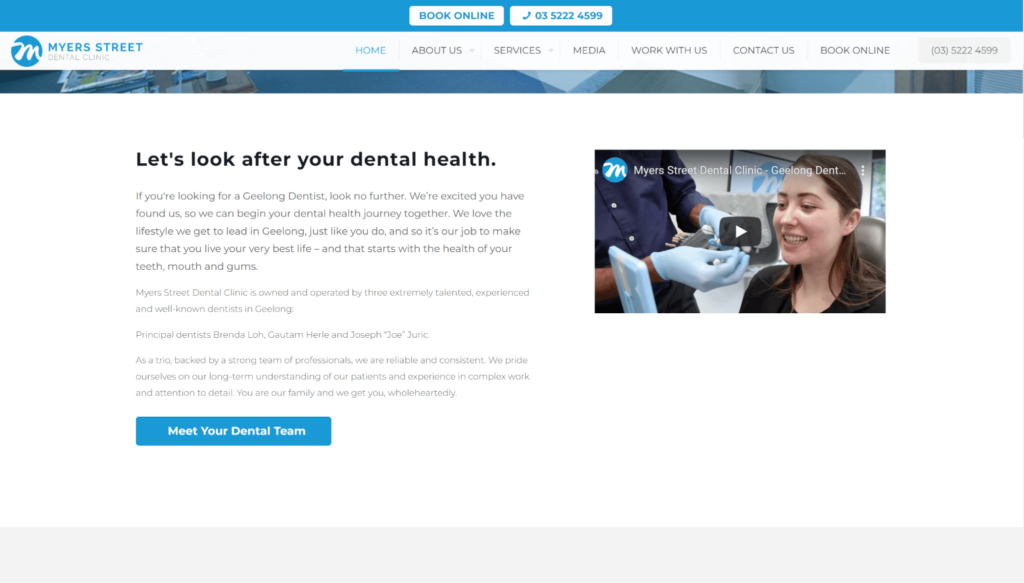
Myers Street Dental
- The Myers Street Dental brand story section explains the clinic’s core values and introduces the 3 principal dentists.
- The call to action button relates to the text and directs visitors to the Team page, where they can meet the team of dentists.
- The video on the right-hand side humanises the 3 principal dentists mentioned in the text by letting them introduce themselves to the potential customer.
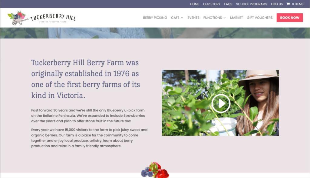
Tuckerberry Hill Berry Farm
https://www.tuckerberry.com.au/
- The Tuckerberry Hill brand story section provides the reader with a nice history of the business and where it is going in the future.
- The video on the right gives a great overview of the business and introduces the viewer to the people who run and make the berry farm happen.
Main selling points
This section is about funnelling the user through to the products or services you sell. You don’t need to list everything you sell in this section, just the highest priority. That might mean having different categories for the things you are selling or picking the most popular things because they are the easiest to sell.
At this stage, you don’t want to overload the customer with too much information, so providing them with a snippet of the most important information about the products or services is OK. As long as you give them enough information to take the next step.
Some ideas for content that goes in this section could include:
- Best selling tours
- Service categories/verticals
- Accommodation options
Secondary selling Points
Secondary services and products are things that can change frequently and support the main experience at your business.
Great examples of secondary products and services include:
- Gift vouchers
- Events
- Packages
- Specials & Promotional offers
- Products or merchandise
Examples of main & secondary selling sections
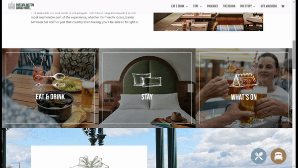
Portarlington Grand Hotel
https://www.portarlingtongrandhotel.com.au/
- Portarlington Grand Hotel shows three main selling points for their venue with strong imagery and clear labelling.
- They use multiple sections for the secondary selling points to give each its own space.
- Strong subheadings have been used for each selling point to capture the customers’ attention.
- For the secondary sections, clear Call To Action buttons has been added to tell the visitor what they need to do next.
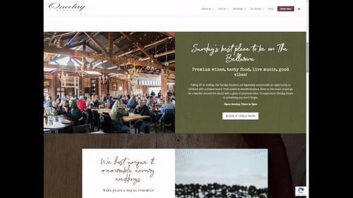
Oneday Estate
- Oneday Estate has split its two main selling points across two sections as they are targeting two distinct audiences – the general public and the wedding market.
- They have also created two secondary selling sections for their Wine sales and Gift Vouchers.
- As the user scrolls down the homepage, they are told a story about the different aspects of the estate. And each section has its subheading that captures the customer’s attention and asks them if this is the section they are looking for.
Social Proof
Establishing trust with your website visitors is crucial to the success of your website. As discussed in this article, gaining prospective customers’ trust is crucial to winning their booking.
Social proof is content that we can showcase that encourages customers to copy the actions of others. For example, a prospect is more likely to book if they can see that a business has a good reputation with other customers. Because you are seen to be trustworthy by others, in the eyes of the prospect, you are trustworthy too, and they are more likely to take the next step once this has been established.
Examples of social proof you can add to your site include:
- Customer testimonials (pulled from authentic platforms like Google or Tripadvisor)
- Stamps or Badges of partnerships or accreditation
- Endorsements by well-known figures
- Media stories
- Social media followers and user-generated content.
Examples of the social proof section:
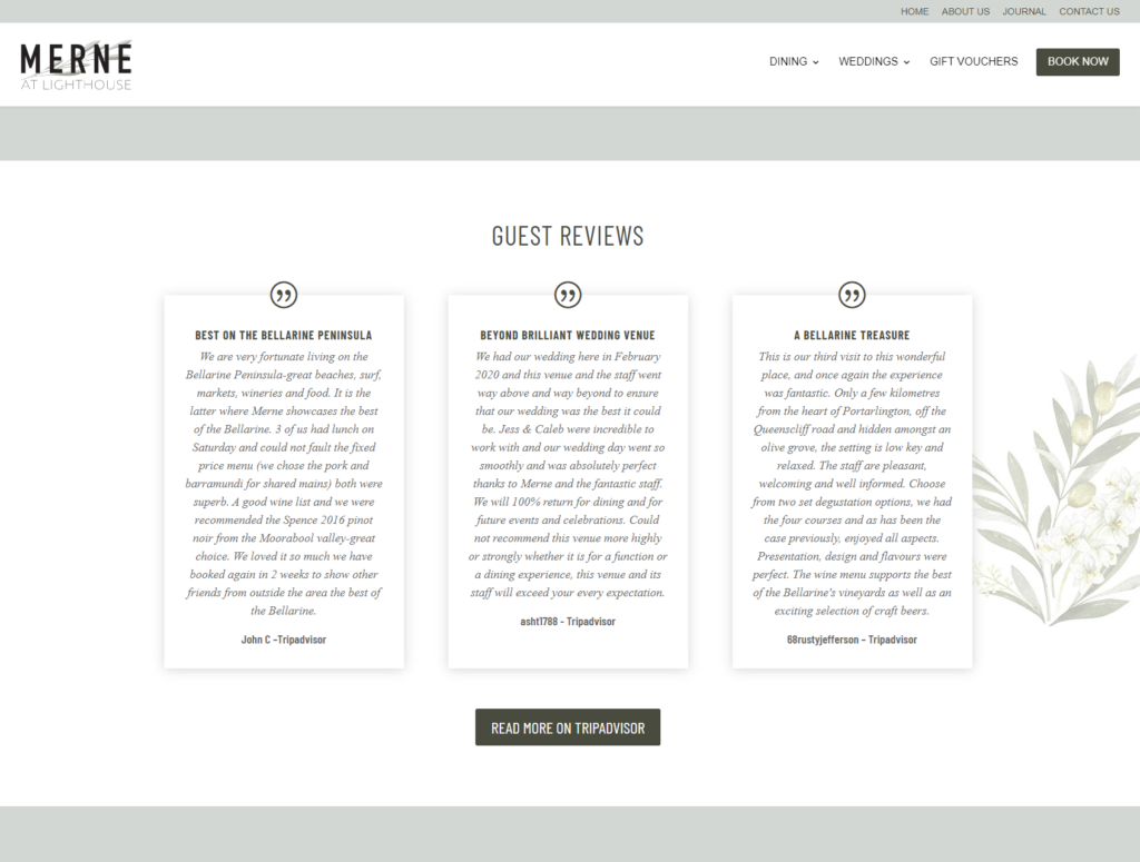
Merne at lighthouse
- A feed of the latest testimonials from review platforms like TripAdvisor, Facebook or Google is a great way of adding authentic social proof to your website.
- By adding a button that takes the viewer to the review platform, Merne is showing that they are confident in all of the reviews on their channels rather than just the ones shown on the website.
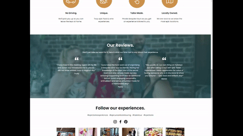
Epic Taste Experiences
https://www.epictasteexperiences.com/
- Epic Taste Experiences uses reviews, social content and partnerships badges to establish trust with its website visitors.
- Showing a feed of a branded hashtag that customers can engage with on social channels is a great way of showing user-generated content on your website.
Kitchen Sink
As you work on your website project, you’ll have many things you feel you want to add, but they don’t necessarily benefit the users’ booking journey. This is where the kitchen sink comes in, here you can put any additional content you would like to add to the site.
Some examples of content that should go into the kitchen sink include:
- Terms & Conditions pages
- A summary of all page site links
- Email & Phone number links
- Links to all services/products or categories
- Social links
Summing up. Maximising the impact of your homepage.
In this article, we’ve outlined 6 sections you must include on your website’s homepage design to capture and engage visitors on their journey to book with you.
There are endless ways you can implement these sections on your website. And the way that you do it will depend on your business and the services/products you offer. We’ve provided you with several examples that showcase different ways these sections can be implemented.
If you’re struggling with how to adapt your business to this structure, you need to take a step back and look at it from the lens of your customer and what their needs are. Remember, the purpose of your homepage (and your website) is to guide your customer through their booking journey, not to make you feel good – that might be harsh, but it’s true.
If you’d like us to walk through your website and provide our professional feedback, please get in touch to start a conversation.
If you’re ready to elevate your brand and marketing to new heights, you might be the right fit for our Flight Plan to Success, where we’ll outline the crucial steps you need to take to ensure your business can generate more bookings on autopilot.

